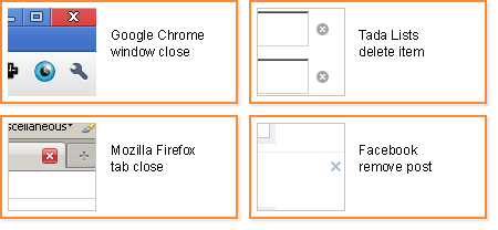
These two meanings are obviously related -- they mean "get rid of this thing". But X to close is really just hiding the X'd item in the sense that you can usually bring back that same view, whereas X to delete is a permanent annihilation of that item.
This distinction seems very obvious to an experienced user, and can usually be inferred from both context and position within the user interface. However, lately I've observed some novice computer users who haven't internalized this distinction getting confused with this dual use of X.
To make matters worse, X is sometimes used to mean other things as well. I've seen it used to mean "cross-reference" in a complex industrial cataloging application. A more typical example is that in Chrome and Safari you will see an X next to the address bar when you are waiting for a webpage to load:

In this case X means "cancel", which meshes somewhat with modal dialogs that use X on a cancel button (interestingly, I could not find an example of this but I know I've seen it). But the same exact X shape is used in Chrome for closing the window, closing a tab, and cancelling search. I wonder how many people this has confused?
Since the days of the Xerox Star system, icons have been very useful convention in graphical user interfaces. They can serve several purposes:
- Adding some graphical interest to screens that might otherwise be a sea of text.
- In some circumstances, provide a small but semi-meaningful click-target without text.
- In other circumstances, enlarge the target area of a menu item or button.
- Provide an additional clue to new users as to what a particular button or menu item will do, theoretically more quickly and subconciously digested than text.
- Create a point of visual recall for experienced users to more quickly find the item they are looking for compared to just text.
The X icon succeeds on #1 and #2, skips #3, but can fail at #4 and #5 for less experienced users.
Suggested Fixes
- Some applications use a different type of X to mean delete, with a kind of a paint-stroke look to it.
- Always labeling the icon can help eliminate confusion.
- Using a different icon for delete can help.
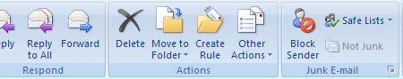
The Microsoft Outlook ribbon bar shows an example of #1 and #2:
An example of #3 is Twitter's use of a trash can icon for delete:

Avoiding confusing re-use of the X icon for different meanings can help alleviate usability issues for new users.
Updated with a new title - Thursday, December 2, 2010.
No comments:
Post a Comment
Note: Only a member of this blog may post a comment.